KTI Logistics Portal
Improving the efficiency and transparency of a growing logistics company in the heart of Lagos.
ROLE
Product Designer
Timeline
6+ months
Team
1 Full Stack Engineer and the KTI Team.
Tools
Figma, Figjam, Google meet, Fathom, ChatGPT, and Notion.
Platform
Desktop and Mobile
Project Details
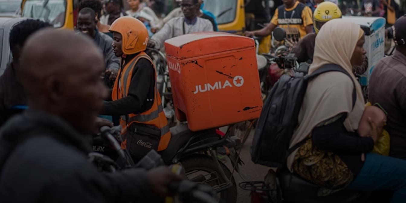
Designing an end-to-end logistics management system for a growing logistics company in the heart of Lagos. Leading to an increase in their overall efficiency, customer satisfaction, and reduction in time wasted creating bulk orders.
20X
Order Processing
Order intake saw a significant growth due to the optimised flow.
100%
Customer Satisfaction
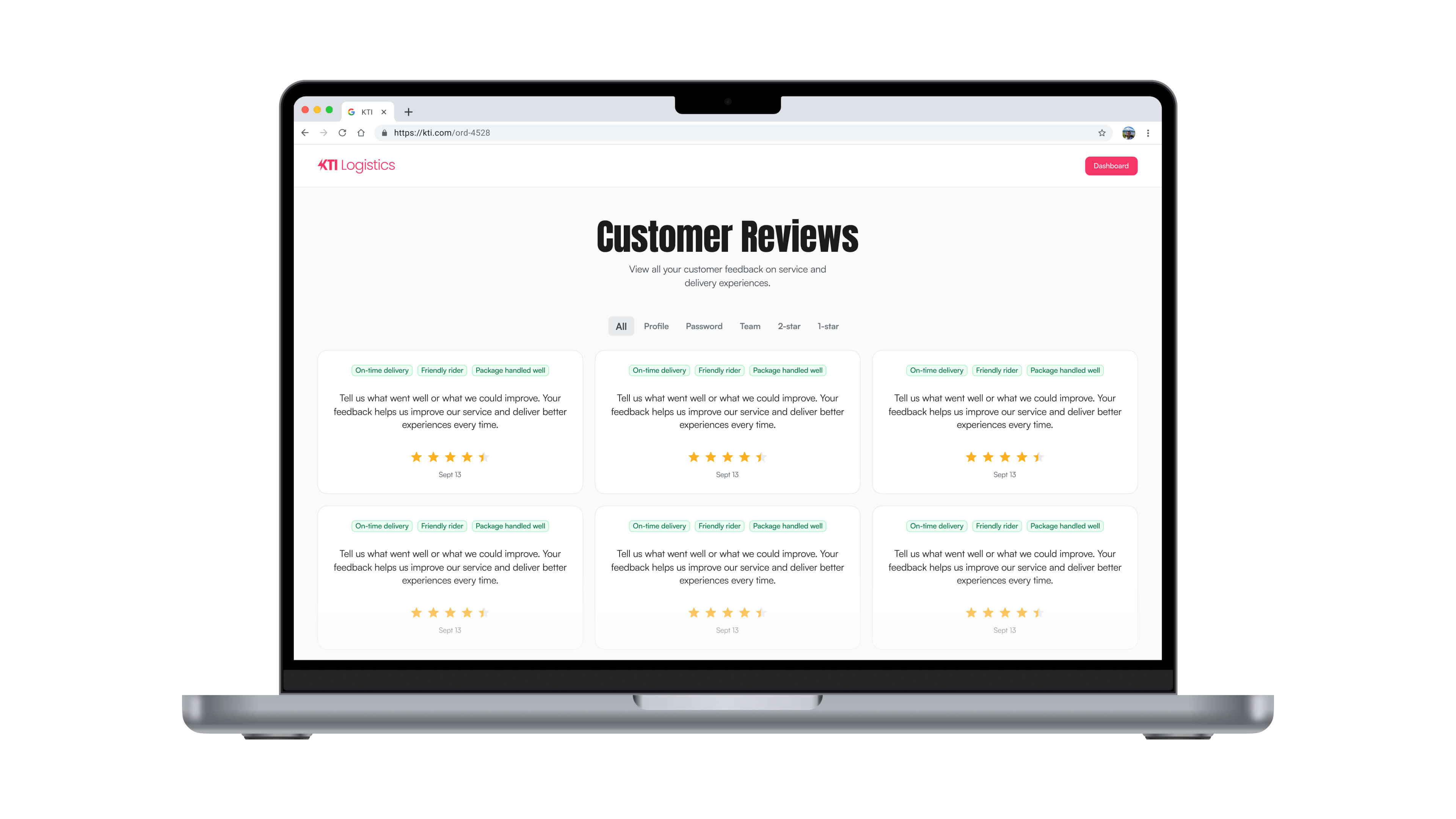
Increase in overall customer reviews and satisfactions.
70%
Saved Time
Reduced time taken to fill up bulk orders.
The Problem
How might we improve the overall operational efficiency of their order intake and delivery flow.
The Goal
Design a centralised, easy-to-use logistics system that enables them to keep track of order intake, get status updates on order progress, build more trust with the businesses and users they work with.
Products Touchpoints
Select one of the products to preview
The Research
Discovery through Ethnographic interviews
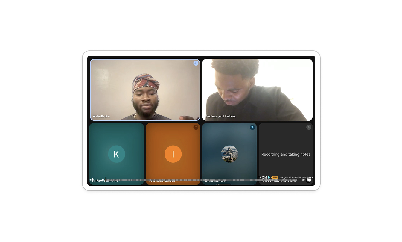
I conducted interviews with the KTI team to gather insights and pain points they currently face with their existing process and how I can improve that process through design.
Pain points
The Ideation
Why it’s important
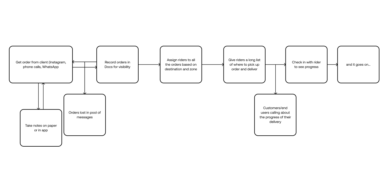
Old flow
The manual flow was limiting and time consuming.
Designed flow
A custom internal logistics management platform that digitises KTI’s existing workflow and introduces structure, automation, and accountability.

Connecting the lines
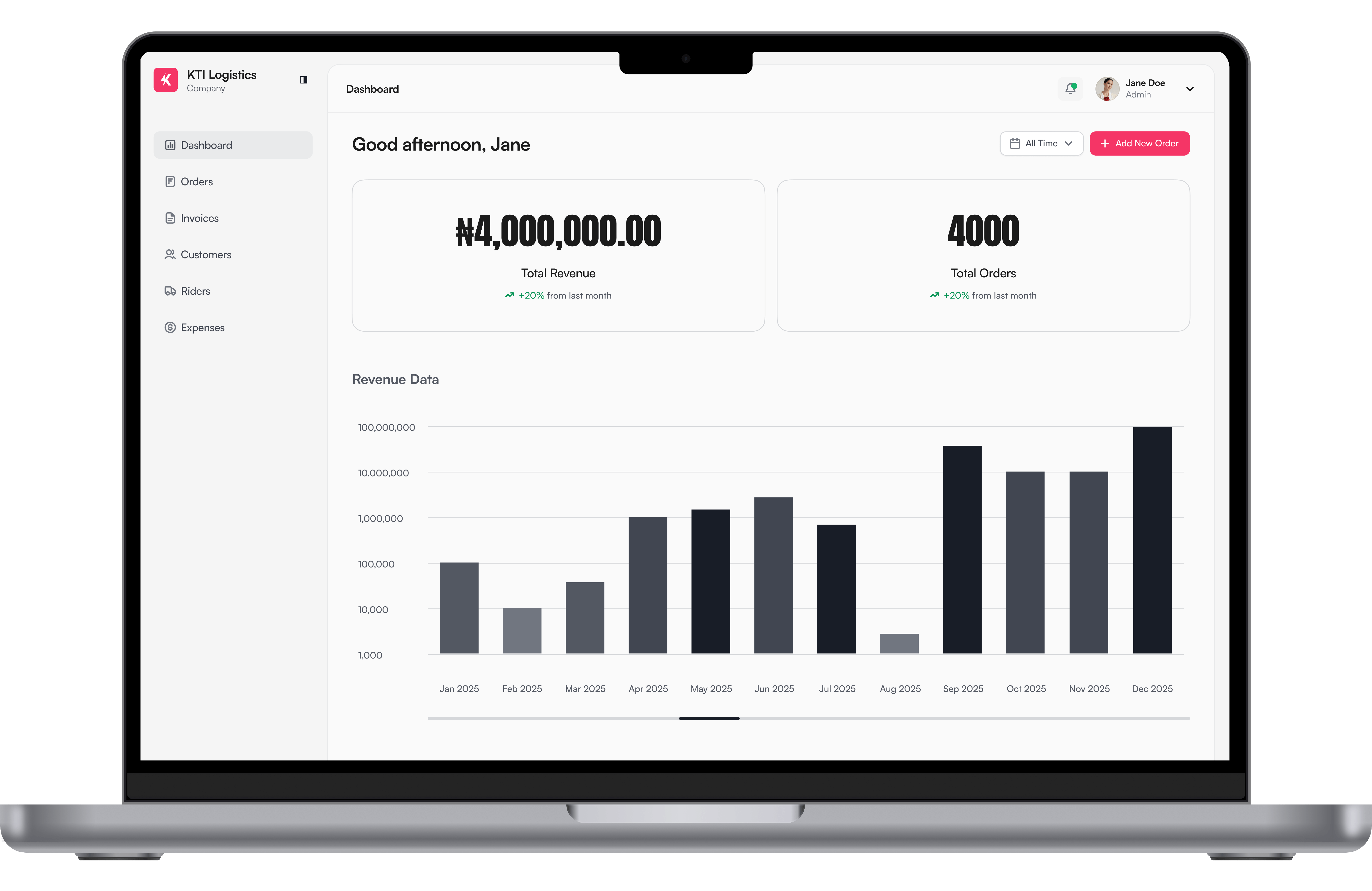
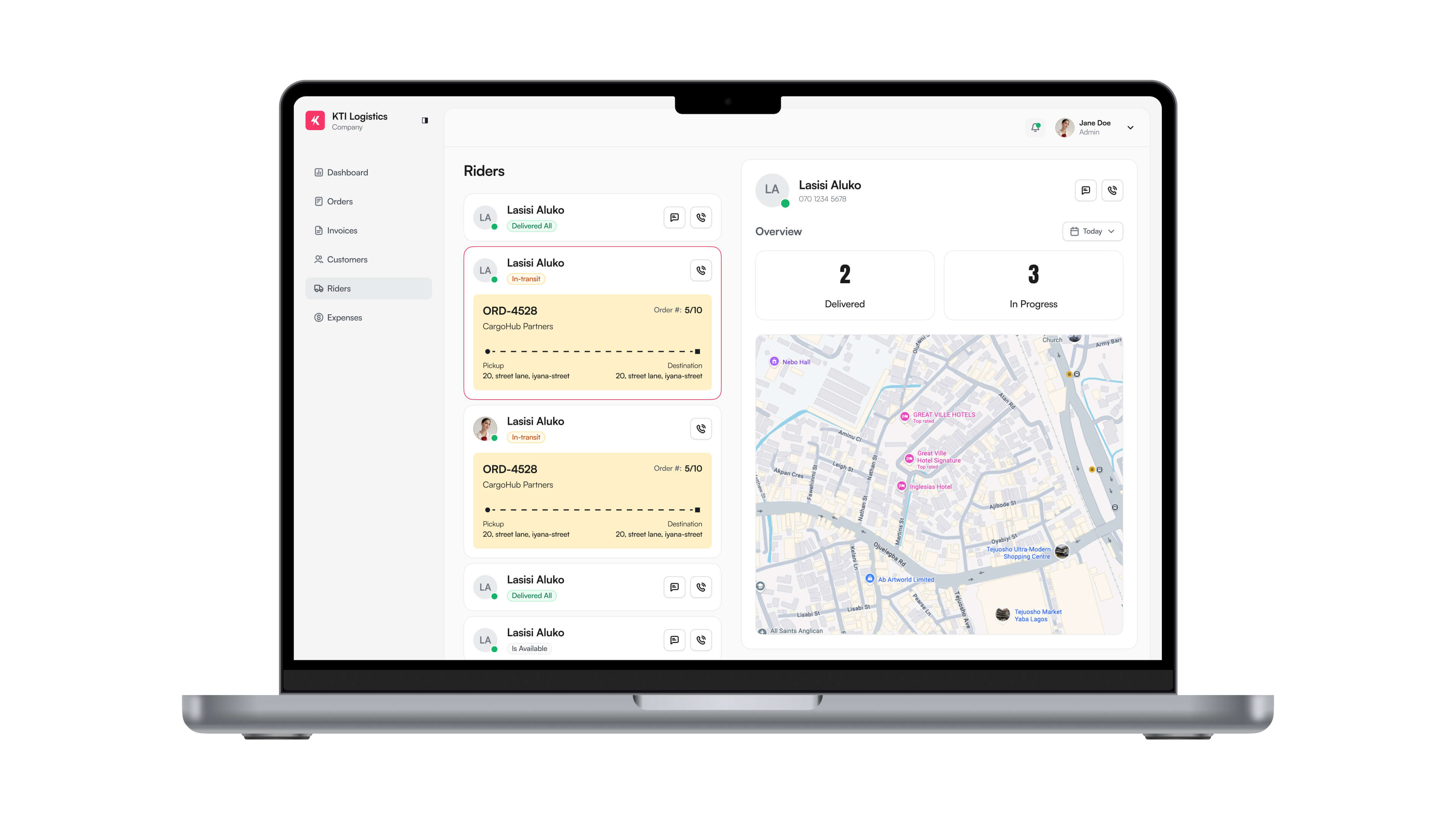
KTI Internal Tool
- Structured order creation flow and bulk order intake from businesses.
- View status of orders through the delivery cycle.
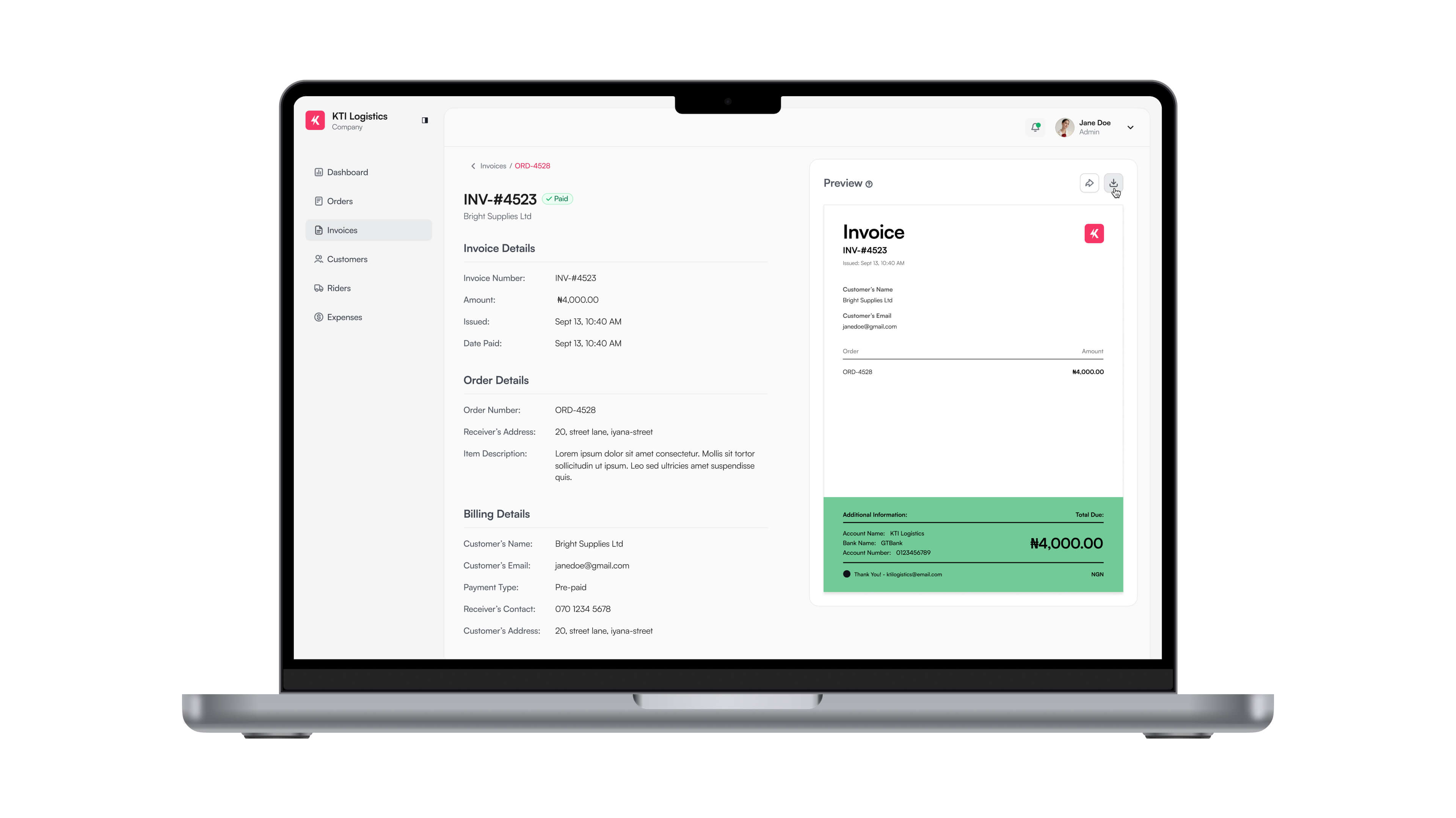
- Create zones and business accounts for their customers reducing the hassle of filling it everytime.
- Keep track of customers who still owes the business with a smart invoicing feature.
Iteration 1 - Order creation
Testing the feature
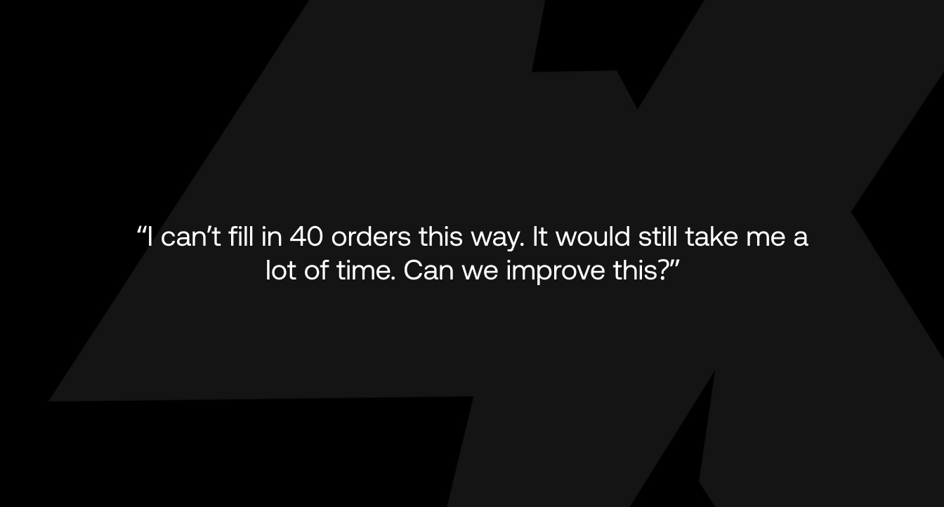
I hadn’t considered how important it was for them to create 30-40 orders for a single business at a time. The initial order intake feature was still taking them time to fill in multiples orders at the same time. So I went back to the drawing board to research how I can solve for this tension.
Iteration 2 - Bulk order creation flow
V2 approved: Improved the bulk order creation flow based on feedback from testing by introducing a zone feature where customers details are already pre-filled into the system based on the zones they fall under cutting the overall steps down to 3 to save time.
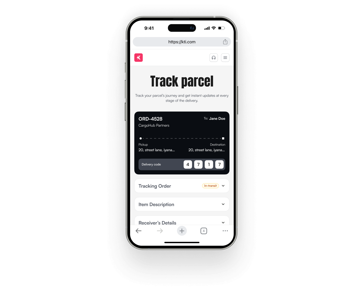
Visibility of order status by admins Flow
KTI gets visibility on the progress of their riders by implementing a status based delivery tracking.
Short term goal
Long term goal
- Real-time geolocation & ETA prediction
- Automated route optimisation
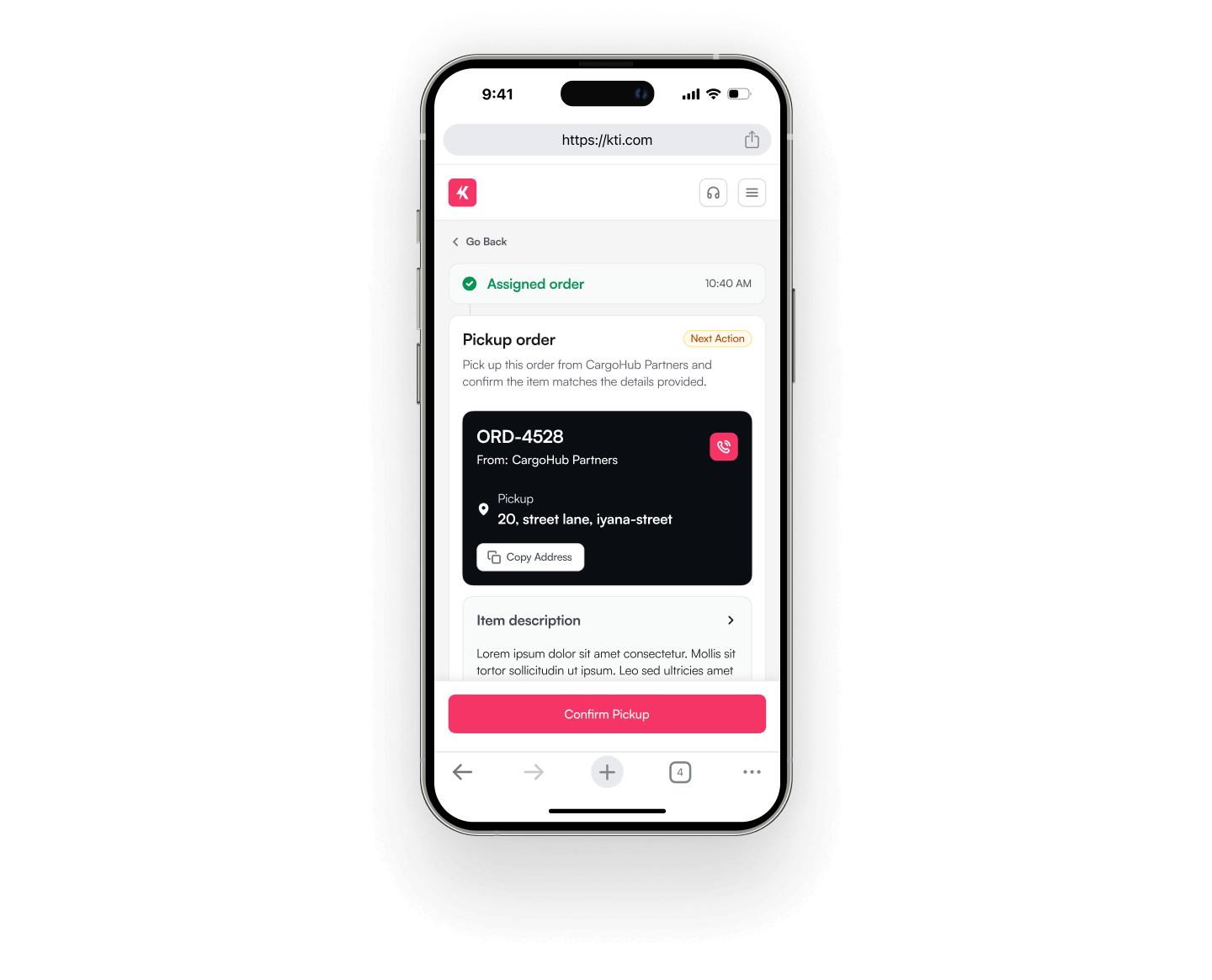
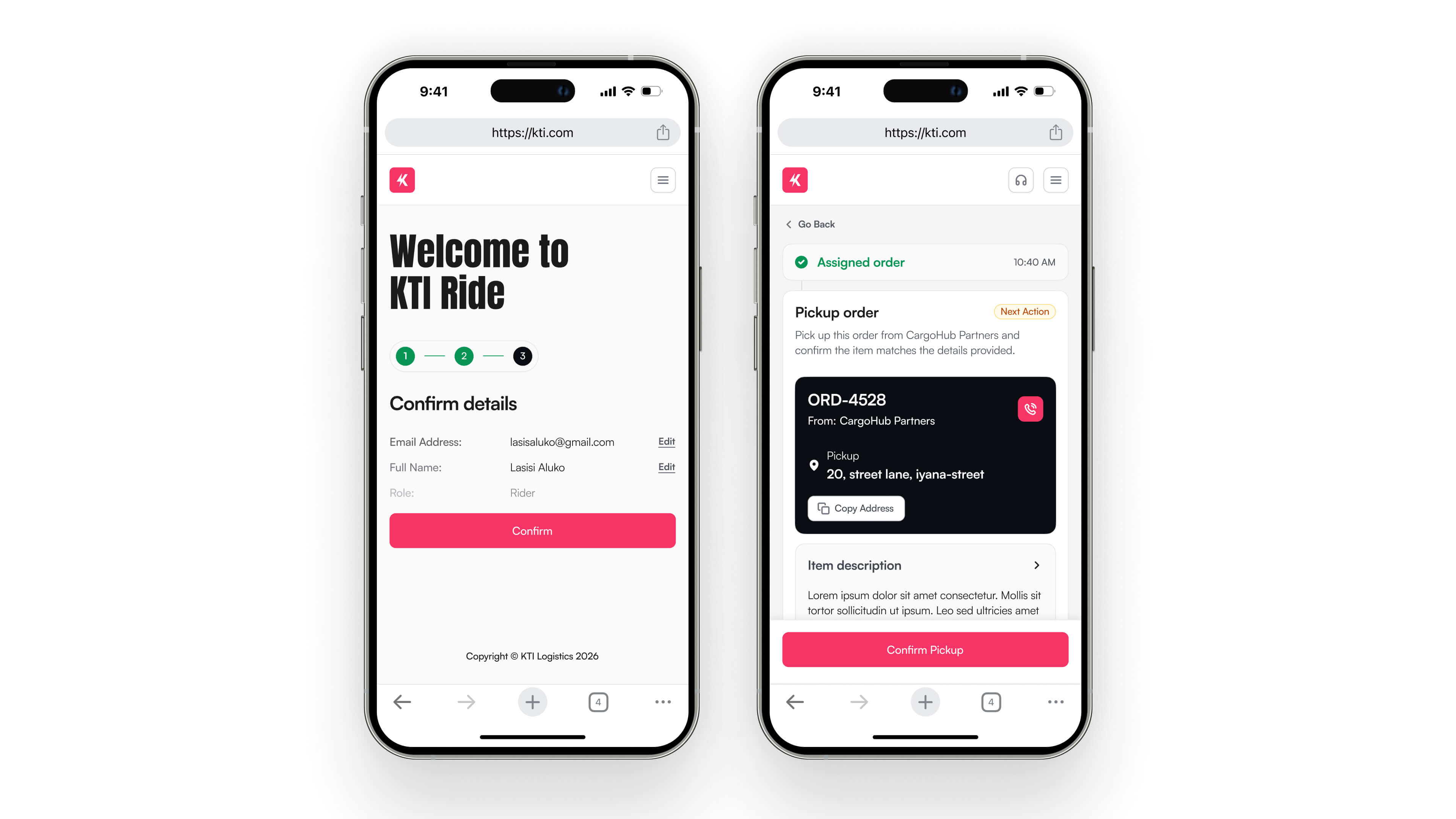
KTI Rider App
Riders send delivery progress and status updates to the KTI team and also to the customers and end users.
Iteration 1 - Rider updates status of order

Testing the feature
Iteration 2
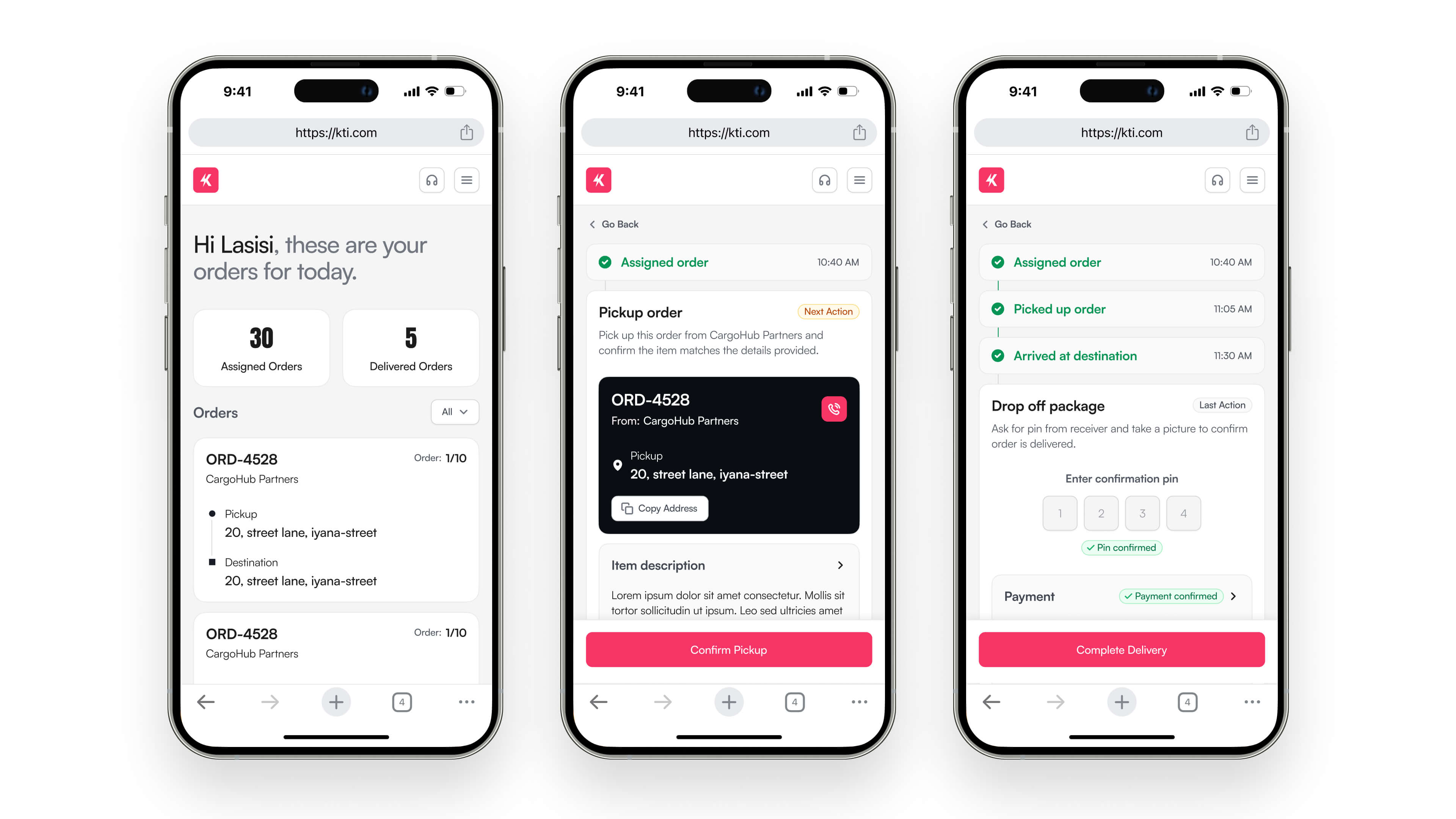
V2 approved: Kept all of the information and status changes on one screen. This way it’s more intuitive and riders can easily track what has been done.
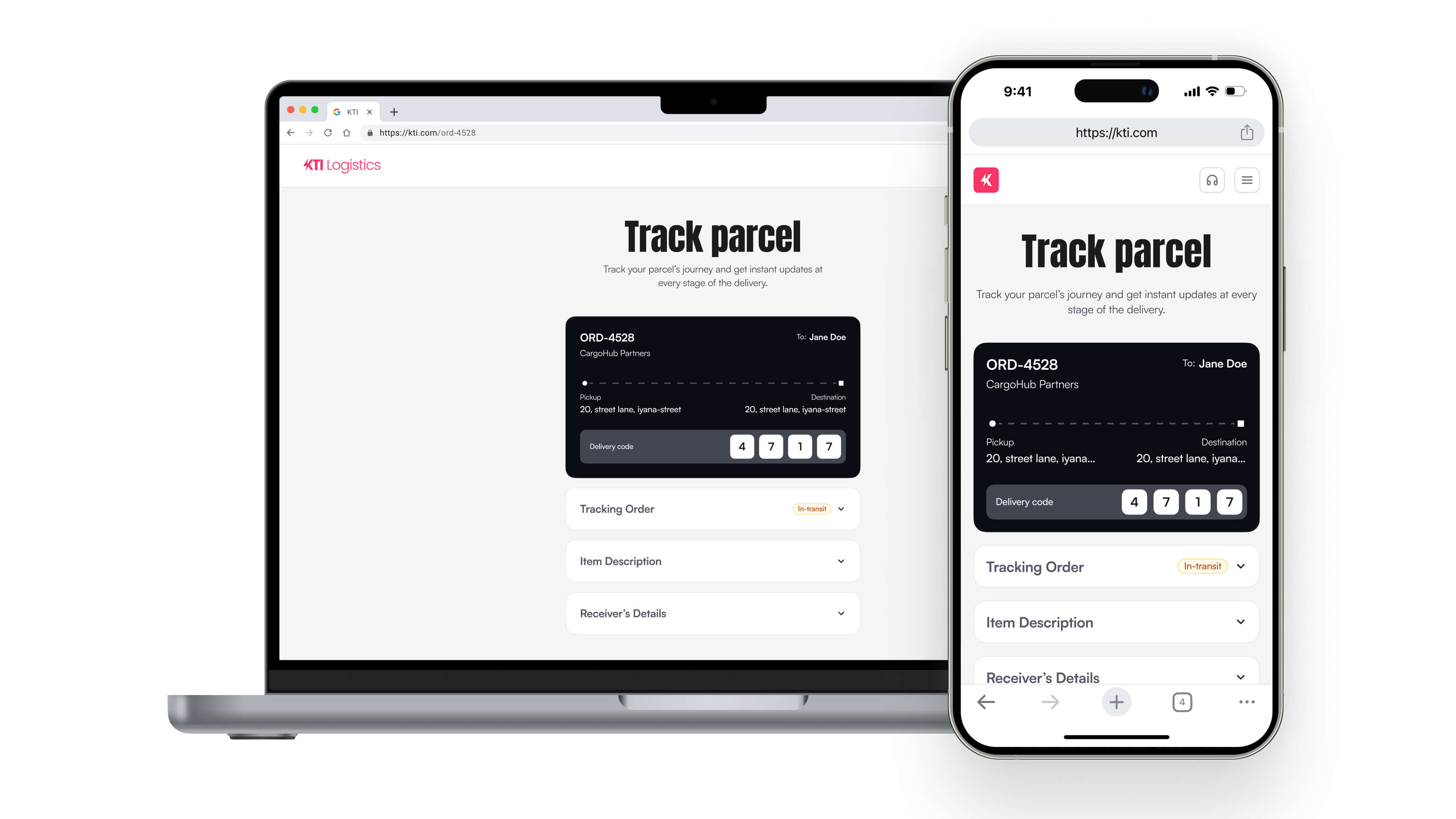
KTI Customers App
Customers and end users also have visibility over the progress of their orders.
Customers/End Users can see progress of order
The Result
Final Delivery


The ending note
Making the tough Decisions
Trade-offs
- Deferred real-time GPS tracking to Post-MVP
- Chose web apps over native apps for the riders for faster rollout.
Post-MVP Opportunities
- Further improving the order intake flow by integrating AI.
- Observe the usage of the bulk order flow.
- Implement easy access to Google maps for riders.
- Real time geo-location tracking of riders.
Reflection
This project opened a pathway for long term business growth for KTI Logistics and a passion of mine for working with small businesses in my community.
Lessons learnt
- I learnt quicker ways to get feedback from the KTI team by communicating always.
- Always keep pushing for a better experience while considering trade-offs.
- Design doesn’t end in Figma prototype and the importance of remote testing.
- Focus on accessibility.
Thank you for getting to the end! To go back to the top, click here. To view other case studies, continue scrolling.
DPO Pay
Request and process payment on-the-go using your mobile phone as a business owner.

ROLE
Product Designer
Timeline
3 months
Tools
Figma, Figjam, Notion, After Effects
Platform
Mobile application
The Introduction
Beginning
DPO Pay Mobile is Africa's No. 1 on-the-go app that helps businesses of all sizes and industries process payments using their mobile devices. You can request a payment in person or by link, allowing your customers to pay with leading mobile money wallets, credit and debit cards, and more. Our mission was to completely redesign the app's UI to match DPO's new brand identity, improve user experience, and create a modern, intuitive user interface.

The Backstory
What was the reason for the Redesign?
DPO has always been one of Defijn’s biggest clients, so when they came to us with a roadmap and proposal to redesign their payment app (formerly called DumaPay), I was assigned the project because I’ve been working on most of their internal products and understand the business goals and what their offerings are.
The DPO team wanted to make a few changes to their previous app to increase transactions by adding more features and improving the user experience of both iOS and Android apps. We were provided with a document that served as a guide on the design requirements.
Requirements
- Key features are charging customers easily and quick easy stats on user’s account.
- Adhere to DPO branding guidelines and platform specific features.
- Benchmark competitors
- Cater for Dark mode on both iOS and Android
- Add new feature; DPO virtual card purchase and management
- Add new feature; Easy advance requests
Goals
Despite DPO Pay's strong foothold in the fintech industry, its payment mobile app's user interface was outdated, and the overall user experience (UX) did not align with modern mobile app design standards at that time. Additionally, as DPO rebranded, there was a need for the app to reflect this new identity visually. Our primary goal was to:
- Design a UI that aligns with DPO's new brand identity.
- Improve the app's UX, ensuring it is more functional and easier to use.
- Implement new key features.
The Process
How we went about the redesign
Insights from Competitor Analysis
We analyzed leading competitors like Flutterwave and Paystack to understand market expectations and identify opportunities for differentiation. From benchmarking competitors, we found that there was a need to design for trust and transparency. A common pain point we found between both apps was that users found it difficult and confusing to sign up, this caused frustrations and drop offs.

Insights From DPO App Review
In as much as we couldn’t carry out user interviews or send out survey questions, we had to somehow find out “what exactly do the users think and feel?” Going through their current app ratings and reviews helped answer our question.
- Users found it difficult to see their balance after a transaction had been made.
- Users couldn’t easily change to a local currency.
- Users wanted to be able to sign up easily because the previous sign up process was unclear.

Created information architecture
Keeping in mind what we discovered from benchmarking their competitors and the app review, we then drafted the information architecture and user flows.

Solution Ideation and style tests generation
We needed to make sure we were aligning the client’s goals with our proposed solutions. What way better to do this than collaborating with them to communicate ideas and generate solutions. We then converged on the following ideas:
- Add a sign up CTA in the app to link new users to the web application sign up flow instead of having to find the web application sign up link themselves.
- Make recent transaction history visible on the homepage.
- Display balance and upcoming on the homepage.
We also created different style tests and finalized the best option with the client (this was an iterative process).

The Result
What we did
We adopted a design language that aligns with DPO’s new brand identity. The use of gradients to show depth and elevation was key to their brand. We kept the overall layout clean and easy to navigate.
Improved Navigation
We redesigned the app’s navigation bar with clear labels and intuitive icons. Letting users recognize information in the interface, rather than forcing them to remember (“recall”) improves the overall user experience.

Overall Better experience
We enhanced the app’s usability by improving its visual hierarchy and making key features stand out. Buttons are larger, call-to-actions are more prominent, and input fields are better organized.
Home screen
The home is the first screen that will appear when a user has signed into the application. We redesigned the home for a better overall user experience by; expanding the hamburger menu items to reduce the number of clicks, making the notification icon more prominent, placing all quick pay links on the home screen so they are visible to the users, adding “Request a Payment” CTA so that users can easily charge customers, making it easy for users to view their balance, change to any preferred currency and view upcoming settlements on their home screen. We also made recent transaction list visible on the home screen thereby reducing the need for an extra click.

Payment Flow
We improved the UX of the payment flow by adding a progress stepper to show users the number of steps required to complete payment. We also removed the “Tap & Pay” feature on iOS as requested by client.

We simplified the screen and made actions clearer. We brought the input field down so users can easily click on it.

Transaction History
We redesigned the transaction history screen by making the filtering action more intuitive and detailed.
Easy to sign up
We added a sign up CTA in the app to link new users to the web application sign up flow instead of having to find the web application sign up link themselves.

Other UI improvements

The End
Conclusion
Challenges and how we overcame them
We could not conduct user interviews and in-depth research as there was no budget for it. Since we were unable to conduct in-depth research, we had to rely solely on the design requirements we got from the client and insights from the UX benchmarks that was carried out.
Closing remark
The DPO Pay mobile app redesign successfully aligned the app’s UI with the new brand identity while enhancing its usability and overall functionality. By streamlining the payment process and improving navigation, we were able to offer users a more modern, efficient, and delightful experience. We redesigned the app to cater for additional solutions that can be added in the future.
Thank you for getting to the end! To go back to the top, click here. To view other case studies, continue scrolling.
Carime
A ride sharing experience that enables old/new friends split cost of trips directly within the app with no hassle.

Role
Product Designer and Interaction Designer
Timeline
December 2022 - August 2024
Team
The team comprised of myself, Paul (Brand Identity Designer), and Damola (Project Manager).
Tools
Figma, Figjam, and Notion.
Industry
Ride-sharing/Ride-hailing
Platform
Mobile application
The Introduction
Product overview
Carimi is a ride-hailing platform that enables riders to share rides with friends and split the costs directly within the app. One of the key challenges Carimi addresses is the hassle of calculating and dividing trip expenses manually at the end of a ride, often requiring the use of external platforms for payment. With Carimi’s built-in wallet system, users can effortlessly split the fare and pay their portion seamlessly, streamlining the entire process within the app.

Turn on bill splitting, add friends, and start group trip.
When you’re not going on a trip alone, we’ve added a group riding feature that allow users add friends to a trip and split bills automatically.

Start trip with the default ride fare or propose an amount.
Want to save more? No worries. Users can choose to start trip with the default ride fare or propose an amount they’re willing to pay. Proposed fee can’t go below the base fee.

Generate confirmation code and automatically share ride details with your emergency contacts.
Users can generate confirmation code to start a trip and automatically share ride details to their emergency contacts.

Add card, credit your wallet to reduce payment time.
Riders can pre-load funds into their wallet for faster, smoother transactions, eliminating delays due to payment processing.

The Problem space
Details of the problem
Users of ride-hailing apps face several pain points, such as fluctuating prices, complicated bill splitting after shared rides, delays due to cash payments, and safety concerns. Carime addresses these challenges by providing transparent pricing, in-app bill splitting, a wallet system to streamline payments, and security features to ensure safe rides.
Key Challenges
- Long driver wait times.
- Complexities in splitting bills among ride companions.
- Payment delays due to drivers not confirming receipts of cash transfers.
- Concerns about ride safety.
- Inconsistent user experience in scheduling and sharing rides.
Target Users
- Students between the age of 18 and 30.
- Professional working-class people.
- An average tech inclined Nigerian person.
User stories


How might we...
- Solve for the bill splitting in a ride?
- Hypothesis - Add riders or share the link, and everyone sees a total estimate of the trip and the breakdowns of their stops.
- Make sharing of ride details seamless?
- Hypothesis - Users should be able to create an emergency list and when they’re on a ride, they can share their details to the list by pressing a share button.
- Hypothesis - Automatically share ride details to emergency contact lists when you start a trip.
- Make trips safer for the users and improve security?
- Hypothesis - Users should be able to confirm their pick-up before the ride starts.
- Hypothesis - In the case of an emergency, users should be able to trigger an alert call to other riders that might be in that region with them for faster security response.
- Improve the rider’s experience while on a trip?
- Hypothesis - Ask rider questions about the trip and notify them that we are there at every step of the trip.
- Reduce the waiting time for a driver?
- Hypothesis - If we can get a good number of drivers on the platform - this would be a challenge when just starting.
- Hypothesis - Propose music or audio that can keep users in the app.
- Hypothesis - Riders should be able to schedule a ride beforehand.
To answer these questions and confirm my hypothesis, I started with some user research.
The Research
Understanding and validating the problem
To design a user-centric solution, a combination of quantitative and qualitative research methods was employed. The research aimed to uncover user frustrations, expectations, behaviors surrounding current ride-hailing apps, and confirm my hypothesis.
Quantitative Research - Getting responses from 146 potential users
Surveys were sent out to potential users, and from the 146 responses I got, I was able to gather data on their ride-hailing app usage, pain points, and preferences for bill splitting and ride safety.

What I found from the survey:
- Majority of the respondents use ride-hailing services because of it’s convenience, privacy, and safety.
- Majority of the respondents will likely stop using a ride-hailing service due to it’s high-cost, lack of safety, and poor customer service.
- 54.7% of the respondents often use ride-hailing services with their friends.
- 84.1% of the respondents are interested in splitting the bills when they’re on a ride with friends.
- 78.7% of the respondents said they would feel more safer if there was an emergency contact in the ride-hailing app.
- In some open ended comments from the respondents, one of them said; they’d love to be able to verify cars and drivers by themself. One of them also said that if they’re using the app, they should be able to notify Carime directly about their safety. Another respondent said they’d probably feel safer if there was an emergency contact in the app.
Qualitative Research - Interviewing 5 participants
While I was waiting to receive a good amount of data points from the survey, I set out to interview potential users. I initially sent out invites to twenty (20) people but I was only able to interview the five (5) that got back to me.
In this interview, I asked them questions like;
- How do they currently use ride-sharing and ride-hailing apps?
- Why do they use ride-sharing and ride-hailing apps?
- What are the pain points and frustrations they face while using ride-sharing and ride-hailing apps?
- What benefits do they intend to get out of using ride-sharing and ride-hailing apps?
- How can Carimi solve their problems?
I found out that:
- Most users struggle with splitting bills after a shared ride.
- Ride fares are perceived as too high and unpredictable, especially during high-traffic periods.
- Safety remains a primary concern, with riders desiring features to verify drivers and share ride details with emergency contacts.
I could see that most of the data confirms my hypothesis thus far.
Key User Needs
- Simple Bill Splitting: Users want to split fares directly in the app without third-party tools.
- Transparent Pricing: Users expect to see the total fare upfront, with minimal price changes during the ride.
- Improved Security: Riders want to verify their drivers and share ride details with trusted contacts.
The Representation
representing the data
Now, with most of my hypothesis confirmed, I began synthesizing the data. This involved, mapping out interview notes, creating the empathy map, and user personas.

User Personas
I created two(2) user personas to align product expectations. One persona is a student who would like to save more on transportation and the other is a business professional concerned about the verification of a driver’s identity.
Persona 1 - The Student
- Age: 22, University student.
- Goal: Save on transportation by sharing rides with friends and splitting the bill easily.
- Pain Point: The current cost of ride-hailing apps is too high, and splitting bills with friends is tedious.

Persona 2 - The Business Professional
- Age: 28, Business owner.
- Goal: Ensure a safe and affordable ride while being able to verify the driver’s identity for security.
- Pain Point: Often feels unsafe with unknown drivers and frustrated with inconsistent pricing.

The Ideation
Foundation of the Solution
Paper sketch
I whipped out my sketch book and started sketching ideas for how contents would appear on each screen. I did this for core screens like the Home, Location search, Group trip, Saved places, Get ride estimate, Wallet, Ride history, and Account.

User flows
Next, I developed user flows to identify each step in the user’s experience, track user journey, and work out any technical constraint that might come up later.

Mid-fidelity Wireframes
After I was done with drafting the basic user flows, I started designing wireframes to capture key features of the app using my initial paper sketches as a guide on Figma. Below is a link to the clickable prototype.
Onboarding Flow

V2: I went with V2 because it was more direct and users can easily get to the sign in screen with lesser clicks. From further testing the two options, it became clear that users also preferred the V2 option.
Home Screen

V1: Went with V1 here because on first glance, users know what next action to carry out and it looked familiar with how other ride hailing apps set up their home (Consistency and Standards). The only issue with this was the addition of another click for the users.
Add Friends Screen

V3: One of the challenges I faced here was finding the perfect balance between too little and too much information on this screen. I later went with V3 because it seemed complete in terms of having the right options for users. I was also hoping that with further testing, the best option will come from user feedbacks.
The Test
Testing the solution
As soon as I was done with the wireframes, the next step for me was to conduct a usability test of the designs to get early feedbacks and make necessary iterations. My goal was to see how users interact with the application and uncover pain points by asking them to perform specific tasks.
This test was carried out remotely (Moderated) on Google meet with four (4) potential users.

Usability finding notes
- All of the users who tested the app preferred the V2 of the onboarding flow.
- User 1, 2, & 3 found the sign-up process slightly long, suggesting clearer messaging on which steps can be skipped.
- User 1 & 2 suggested a confirmation step when adding funds to the wallet.
- User 2 was confused at the adding a friend to trip screen. He suggested that users should be able to start trip without other friends who can’t confirm.
- User 3 was actively looking for settings but couldn’t find it. She suggested that it would have been better to improve it’s visibility.
- User 1 said he is used to the basic flow of ordering a ride, “this is a new type of ride order, I would love it if the number of steps can be reduced.”
Some positives...
- User 2 gave the app 7.5/10 overall experience rating.
- User 3 said automatically splitting the bills makes the work easier; “I don’t have to calculate anything”.
- User 4 said “the overall experience was friendly, it was easy to use and it was a good experience”.
The final result
Designing the solution
With the feedbacks in mind from my usability test, I went on to update the UX of my initial wireframes. From this updated UX design iterations, I proceeded to create the UI of the app.
Using Figma, I was able to design the UI of the app keeping in mind the brand message. The goal was to create a UI that was fun, user-friendly, relatable, bold and simple.
My Inspiration
For this project I pulled inspiration from Pinterest, and competitors app.

Iterative design solution
I tackled the design challenges iteratively keeping the user testing feedbacks in my mind at every step of the way.
Improved the Onboarding flow based on user feedbacks
The onboarding flow was revisited based on the results from the usability test. I reduced the number of steps it takes for a user to create an account and made the call to actions more prominent with clearer messaging.

I revisited the KYC flow based on the user test feedbacks.
With the usability results, I updated the KYC flow by reducing the number of steps and making the “Skip” call to action more visible to the user. I was able to achieve this by placing it at the bottom part of the screen. I also added some form of incentive system for the users so they can be inspired to complete the KYC flow.


Updated the Home screen based on the user testing result.
Improved the experience of the home screen by indicating user’s current location and giving them the option to change it with the dropdown, keeping primary actions fixed to the bottom part of the screen and making the map widget bigger so that users can easily use this feature to set their location. To address one of the feedbacks I got from the usability test, I reverted back to the V2 wireframe option I had made for the “Solo” or “Group” ride ordering call to action.

Redesigned the Add Friend screen based on user feedbacks.
To tackle one of the feedbacks I got from my usability test, I reverted to one of the previous version I had created in the wireframe stage, I removed the “Friends on Carime” feature and made the process of sending an invite clear and less confusing to the users. I also improved the overall UX of this screen by making messages and call to actions clearer.

Added a Confirmation screen on the wallet funding flow based on user feedbacks.
I added a confirmation screen for the user when they are funding their wallet. This came up as a result of the feedbacks from the usability test.

Made Account Settings more visible.
The account management screen was revisited based on a feedback from a user during testing. To improve the visibility of the account settings option, I added it as a visible option on the user account screen.

Other UI Screens
Here are other UI screens from the project.


.jpg)


Design system and UI widgets
Keeping the look and feel consistent.
During the course of the design, I hoped to create a sustainable design system that could be used continuously in future iterations of the app. Below are a few of the components that I worked on.


The Conclusion
Set backs, Next steps, & Key Take aways
Set backs
- Due to school work and my full-time job at that time, I struggled to make major progress on this project as much as I would have loved to. This caused a huge extension in the timeline of the project.
- I found it hard to give incentives to my interview participants due to financial constraints. This sort of made it difficult to find people to interview but I was able to overcome this challenge by reaching out to more close people who were willing to sit and chat with me about their experiences with other ride-hailing apps.
- My initial plan was to make this project go live but I was unable to find an experienced app developer who was willing to come on the project just for fun and also build it as a side project.
Next steps
- Design the Get Ride Estimate flow (post MVP).
- Design the driver side of the app.
- Build the app and launch it on both App store and Google play store.
Key take aways
Ownership, working with constraints, and user research.
You know how they say a city wasn’t built in a day? I got to experience that working on this project. I learned a lot through the course of this project. It was one of my biggest personal projects, and I got to understand how to take a project from 0-10.
Sometimes, I had huge concerns on if I was ever going to finish this app because of the time I spent away from it but with encouragements from my friends, I kept pushing.
Working on this app also taught me a lot about the importance of user research, and putting the needs of the user front and center. I got to experience actively applying the things I learned to the choices I made on user experience and design patterns.
Thank you for getting to the end! To go back to the top, click here. To view other case studies, continue scrolling.
Defijn
End to end experiential and conversion focused website redesign and development for a global African design agency.

Role
Visual Designer and Webflow Developer
Timeline
January 2024 - April 2024
Team
The team comprised of myself, another visual designer, and the creative team director.
Tools
Figma and Webflow
Platform
Fully responsive website
The Brief
Introduction
Defijn is a full-stack digital product agency that specializes in creating end-to-end experiences for a global client base. Since 2019, Defijn has been at the forefront of digital innovation, delivering human-centric digital solutions across five continents. In our mission to hone our creativity, make cool stuff, and reach out to more clients, we embarked on a journey to refresh the brand and redesign the website, showcasing our capabilities and global success in a more dynamic, fashion-forward way.
The Context
Why we wanted a redesign
Who knew that one of our random conversations on how it is we create amazing designs for clients but haven’t had the time to evaluate our brand positioning or even thought about redesigning the company’s website will lead to one of the biggest projects I was a part of this year?
The Defijn website was designed to be more than a digital brochure—it serves as a reflection of who we are; a bunch of rad individuals from different areas of life coming together to form a beautiful culture, tell our story, reach out to a new client base and have fun while doing it. As part of our brand refresh, the goal was to create a non-conventional, experimental, and visually striking website that would embody the essence of the brand’s evolution to show that development side of the company.
CURRENT SITE DRAWBACKS
- Simplified approach but lacks interaction/animation to tie everything together.
- Work/visuals only shown as showcase and not as visual impact elements (Other than the showcase images, imagery/visual not utilised to full potential).
- Lacks identity/charm (could even say it lacks a gimmick which some sites use as a substitute for identity).
- Lack of interaction/visual interest
EXPLORABLE CONCEPTS we came up with
- Large flashy imagery/mockups
- Hyper-minimal/analogue
- Large scale scroll animations/interactions
- Full scale modularity
- Wireframe style
- Non-conventional

Project goals and objectives
- Reinforce the brand refresh on the new website.
- Semi-timeless design; contemporary but minimal page structure that won’t phase out quickly.
- Cinematic (large) Imagery.
- Bringing dev more to the forefront of Defijn.
- Minimal but also flashy website.
The Direction
Art Direction - How we made it happen
After we’ve highlighted the current site drawbacks and explorable concepts, it was time to start creating designs that would meet our objectives. We decided to go with the following directions; Not too crazy design, Good use of typography and grid, Experimental design, Tie images together, Explore street style design, and Timeless design.

TYPOGRAPHY EXPLORATION & TREATMENT
Using the visual exploration board that was created by my fellow teammate, I started exploring typeface options, fonts pairing, and created different content layouts.

Random Ideas
I wrote out a list of random ideas for the website.

UI MOOD-BOARD
I curated a mood-board with designs that were similar to the ideas I had and inline with the overall direction we were going with.

UI Exploration
With the objective in mind and UI mood-board I created, I began exploring new concepts for the website UI.

The Result
what we created
Overall UI Direction
The overall UI direction covered the use of: 8-bit font to show the development side of the agency; unconventional grid style and layout to break contents; subtle interactions; black, white and grey colours only because we wanted the projects and images to bring colours into the website; animated pixelated illustrative icons tied to the 8-bit font; easter egg. Through an iterative design approach and getting early feedbacks, we were able to achieve our goal (design a rad website!).

The Conclusion
Challenges, Next steps & Key Take aways
encountered Little bumps on the road
One of the initial challenges I encountered was the unconventional design approach we adopted from the outset. Using the visual exploration board that had been created, I began experimenting with various design directions almost immediately. I was able to overcome this by designing iteratively. Getting early feedback ensured I was moving in the right direction of how we intended for the website designs to come out.
Another significant challenge was finding the right balance between being bold and extremely experimental while ensuring that the website remained accessible and user-friendly. We wanted to push boundaries with unconventional layouts, dynamic visuals, and a touch of controlled chaos, but we also needed to communicate clearly with users. Striking this balance meant that we constantly revisited designs to ensure that they weren't too chaotic or overwhelming.
Next steps
- Add Webflow Professional Partner badge.
- Build the 404 Page.
- Build the Insights Section and Insights Detailed Page.
Key take aways
With the iterative design approach we implemented, I learned how to best navigate and communicate design ideas and decisions to my teammates on time. I love how we collaborated on this project and ensured that every aspect of the design, from the smallest detail to the overarching vision, was carefully considered and refined. While the entire team’s collective input was invaluable, the experience of driving design ideas helped me learn what it truly means to take ownership of a project.
Thank you for getting to the end! To go back to the top, click here. To view other case studies, continue scrolling.
Raize
A desktop app where you can save, obtain affordable loans, and enjoy exclusive product discounts as a member.

Role
Product Designer
Timeline
7 months
Team
The team comprised of myself, Daniel (Front-end Developer), Timilehin (Back-end Developer), and Ukeme (Project Manager).
Tools
Figma, Google Docs, and Notion.
Platform
Web application and marketing site design
Introduction
Raize is a digital cooperative society platform, designed to provide users with an accessible way to save money, obtain affordable loans, and enjoy exclusive product discounts. The platform’s goal is to help members solve their financial problems by pooling resources and empowering themselves economically, socially, and culturally.
Save money for rainy days and withdraw easily anytime you want to.
A streamlined savings process allows users to select savings plans (daily, monthly, or quarterly), track their interest, and receive tips on financial management.

Request a loan when you’re eligible to.
The loan application process was simplified, with clear interest rates based on the loan amount.

Identifying the problem
The Problem statement
In Nigeria, many individuals struggle to meet financial obligations such as rent, school fees, business capital, and healthcare costs. Existing cooperative societies are typically physical and often lack innovation, effective management, and strong networks, limiting their potential to solve members' financial problems. Furthermore, membership of most of these cooperatives are often not based on skills or business acumen, leading to poorly managed funds and unprofitable investments.
Key issues we aimed to address included:
- A lack of innovation and skilled management in cooperatives.
- Poor communication with members.
- Limited networking opportunities with businesses and institutions.
- A disconnect between younger, tech-savvy Nigerians and the cooperative model.
Approach to Problem-Solving
We began by asking fundamental questions such as:
- How might we make savings and loans easily accessible to our members?
- How might we encourage members to solve their financial problems collectively?
- How might we bridge the gap between traditional cooperative societies and digital platforms?
These questions helped us define core features for the platform, including:
- A seamless digital savings experience, allowing users to set goals, track progress, and receive reminders.Access to affordable loans with transparent interest rates.Discounted products through partnerships with companies.Regular communication to encourage savings and financial discipline.
Conducting research
Due to budget constraints, we couldn't conduct extensive user research. Instead, I conducted primary research by interviewing stakeholders to gather insights into the problem context, user goals, and business objectives. This was followed by secondary research, where I reviewed a feasibility report, conducted desk research on the market, and audited existing solutions like lapo.
Key Insights from Stakeholder Interviews
- Raize aims to build an online platform that offers financial services such as savings, loans, and product discounts.
- The target audience includes young professionals in Nigeria who are familiar with technology but disconnected from traditional cooperative models.
- The cooperative seeks to raise initial funding from members to sustain operations until they generate revenue.
Insights from the Feasibility Study
- Collective savings foster financial discipline and help individuals tackle financial problems.
- Many Nigerians avoid bank loans due to high interest rates, opting for microfinance institutions and cooperatives instead.
- The cooperative model can benefit from technology, particularly for young professionals who are not familiar with physical cooperatives.
Market Research & Competitive Analysis
We analyzed the cooperative landscape in Nigeria and identified that cooperative societies contribute over N416 billion to Nigeria’s GDP. However, most are still operating offline. We found that 66% of professionals are willing to join a digital cooperative platform, and mobile applications were the preferred mode of access. Competitors like Lapo, Piggyvest, and Cowrywise presented potential threats, but their focus was more on traditional financial services, leaving room for Raize to carve out a niche with its cooperative model.
Designing the Solution
Setback
Initially, I assumed a mobile app would be the best solution due to the growing smartphone penetration in West Africa. However, after discussions with stakeholders, we decided to launch a responsive web app as a first step.
Product Requirements
- A web based application for seamless digital savings experience, allowing users to set goals, track progress, and receive reminders.
- Users should be able access to affordable loans with transparent interest rates.
- A platform where users can have access to discounted products through partnerships with companies (post MVP).
- Regularly communicate with it’s members to encourage savings and financial discipline.
Ideation and Wire-framing
I started by sketching low-fidelity paper wireframes, which helped visualize key features quickly. These sketches then informed the development of a mid-fidelity wireframe.


UI Screens
Using Figma, I was able to design the UI for the platform.
Dashboard
Users could view their savings goals, track progress, and receive notifications for milestones. This feature aimed to solve the problem of financial visibility and motivation.


Savings
A streamlined savings process allowed users to select savings plans (daily, monthly, or quarterly), track their interest, and receive tips on financial management. This addressed the issue of building long-term savings habits.


Loans
The loan application process was simplified, with clear interest rates based on the loan amount. Notifications kept users informed about repayment schedules, making it easier for them to manage their loans.


Account Management
A user-friendly account dashboard helped users manage their accounts, KYC, and account security with ease.


Style Guide & Direction
Raize is a digital cooperative society platform, designed to provide users with an accessible way to save money, obtain affordable loans, and enjoy exclusive product discounts. The platform’s goal is to help members solve their financial problems by pooling resources and empowering themselves economically, socially, and culturally.
Evaluation & Reflections
Measuring Success
Due to the project timeline, we were not able to see success with the app through metrics. However, if we had launched as intended, our key success metrics would have been based on user engagement and financial outcomes:
- Number of registered members.
- Total savings contributions.
- Number of loans accessed.
- Discounts redeemed by members.
What I Learned
- Working with tight budgets and limited research can be challenging, but it taught me the importance of focusing on essential features and maintaining a lean approach.
- Collaboration with stakeholders is key to uncovering valuable insights, even in the absence of full UX research.
What can be done for Future Improvements
- Many of the decisions made for this platform was based on the insights we gathered through stakeholder interview, feasibility report, and market analysis; not deeply rooted in any user interviews. However, an appropriate next step would be to test our assumptions and validate the user experience choices that we have made.
- While we couldn’t confirm if the web application was successful, It would be a good thing to explore the development of a mobile app post-launch. A mobile-first approach could further improve accessibility, especially for younger, tech-savvy users.
Thank you for getting to the end! To go back to the top, click here. To view other case studies, continue scrolling.
Maverick City Music
Designed a fan site for Maverick City Music.

Role
Art Direction and Visual Design
Timeline
December 2022 - November 2023
Team
The team comprised of myself and Olamide (Front-end Developer).
Tools
Figma and Notion
Platform
Desktop website
Introduction
Maverick city music has always been a big part of my creative process and a source of inspiration. They are a group that disrupts the norms of Contemporary Christian Music (CCM) by creating space for marginalized voices.
Disclaimer: We were no way contracted by Maverick City Music to build this website. We only created this as a fan site but Maverick City Music team can reach out if they would want to discuss further on this with us.
Background of the project
As a fan and designer deeply impacted by Mav City’s work, I wanted to create a website where I could tell their story, do something unorthodox, and break some rules while doing it (that is design rules). I had a chat with my friend Olamide who is a front-end developer and he was down to build the website with me.
And this was how we embarked on this thrilling journey to tell the Maverick story in our own unique way.
“Unorthodox, free spirit, rule breaker, one that breaks away from the herd.”
The Goal
The goal was simple, show how great this group of individuals are and capture their passionate spirit.
Art Directing the process
From the outset, the vision was clear: we wanted to build a fan site that would show Maverick City's ethos—unorthodox, free-spirited, and rule-breaking (not in a bad way please). We know we wanted the site to feel different, contemporary, and explorable, much like their music but how to go about it in design wasn’t clear yet.
The learning and understanding phase
I began with in-depth research on Maverick City Music, looking at their visual identity and tone across social platforms. We wanted the fan site to feel like an extension of their world—something other fans would be able to connect with on a deeper level.
Creating an Inspiration-board
Started looking at some website references that were somewhat similar to what we were trying to achieve with this fan site to see how we might go about it.

Typography exploration
For the typography, I went for a display font that conveyed old but looked contemporary. Going through some of their album covers nudged me in the right direction. Then I started looking at font foundries (I think I must have spent a whole day looking for the right font here) for fonts that might work. I then created a quick type layout of the two fonts that stood out and with the help of my roommate, I was finally able to decide on the one to use.


Wireframing

It all gets better from here...
Tying it all together with a story
Creating the final UI - Finding the missing gem
For the intro screen loader animation, I thought of initially using like a year countdown from when the group was formed until the present year, but then I got inspired by one of their album covers that looked like an old tv screen then I started thinking what if we went in a direction of having the website look like an old tv screen and we used like one of those old tv loaders to bring users into the website. You guessed right. Yes, we decided to go with this direction and kept the previous loader idea to act as quick loaders for page to page transitions.


Menu
Old tv menu inspiration behind the menu screen.

Members Page
Team members page was inspired by one of Maverick City’s picture style.

Music Page
Album covers direction was influenced by old vinyl record album covers.

Videos Page
Videos Page inspiration came from films used in old video cameras.

Credits
The credits screen is just like the end of a movie and it shows who played a role or helped in this project one way or the other.

Error 404 Page
The error 404 page was inspired by this error mode on old tvs.

Other UI screens


Challenges & What I learned?
I initially struggled a lot with getting things done; it always came as the least priority for me cause I had school work and my full-time job as of then. But I was able to overcome this and make progress in design by scheduling 4 hours every weekends to work on the designs.
This project was more than just a fun design exercise—it was a journey of creative expression rooted in admiration for a group that has changed the lives of so many. I learned the power of storytelling, not just through music but also through digital design.
Fun fact: I only played Maverick City’s songs when I was designing this website and I'm probably listening to them as you're reading this :)
Display1
Display2
Display3
Display3
Heading 1
Heading 2
Subheading 1
Subheading 2
Subheading 3
Microheading
Lorem ipsum dolor sit amet, consectetur adipiscing elit. Suspendisse varius enim in eros elementum tristique. Duis cursus, mi quis viverra ornare, eros dolor interdum nulla, ut commodo diam libero vitae erat. Aenean faucibus nibh et justo cursus id rutrum lorem imperdiet. Nunc ut sem vitae risus tristique posuere.
Lorem ipsum dolor sit amet, consectetur adipiscing elit. Suspendisse varius enim in eros elementum tristique. Duis cursus, mi quis viverra ornare, eros dolor interdum nulla, ut commodo diam libero vitae erat. Aenean faucibus nibh et justo cursus id rutrum lorem imperdiet. Nunc ut sem vitae risus tristique posuere.
Text LinkWhat’s a Rich Text element?
The rich text element allows you to create and format headings, paragraphs, blockquotes, images, and video all in one place instead of having to add and format them individually. Just double-click and easily create content. The rich text element allows you to create and format headings, paragraphs, blockquotes, images, and video all in one place instead of having to add and format them individually. Just double-click and easily create content. The rich text element allows you to create and format headings, paragraphs, blockquotes, images, and video all in one place instead of having to add and format them individually. Just double-click and easily create content.
The rich text element allows you to create and format headings, paragraphs, blockquotes, images, and video all in one place instead of having to add and format them individually. Just double-click and easily create content. The rich text element allows you to create and format headings, paragraphs, blockquotes, images, and video all in one place instead of having to add and format them individually. Just double-click and easily create content. The rich text element allows you to create and format headings, paragraphs, blockquotes, images, and video all in one place instead of having to add and format them individually. Just double-click and easily create content.
This is an h2 heading inside rich text
A rich text element can be used with static or dynamic content. For static content, just drop it into any page and begin editing. For dynamic content, add a rich text field to any collection and then connect a rich text element to that field in the settings panel. Voila!
Static and dynamic content editing
A rich text element can be used with static or dynamic content. For static content, just drop it into any page and begin editing. For dynamic content, add a rich text field to any collection and then connect a rich text element to that field in the settings panel. Voila!
A rich text element can be used with static or dynamic content. For static content, just drop it into any page and begin editing. For dynamic content, add a rich text field to any collection and then connect a rich text element to that field in the settings panel. Voila!
How to customize formatting for each rich text
Headings, paragraphs, blockquotes, figures, images, and figure captions can all be styled after a class is added to the rich text element using the "When inside of" nested selector system.